How Much Does it Cost to Remodel a Kitchen in the Twin Cities?
Are you dreaming of a new kitchen and wondering how much you’ll need to invest? We breakdown the costs for two kitchen remodels and what factors drive those costs.
See inside as we build a mudroom addition and remodel the kitchen of this 1920s Lake Nokomis home.
In the existing floor plan, the garage/back yard entry provided no interior transition space for the family of 4 to comfortably get inside and unload. With a pinched entry dumping the family into the already tight kitchen, our clients knew that rethinking the space was critical. With the home’s proximity to Lake Nokomis, the family prioritized staying in their neighborhood but still needed a modern kitchen and mudroom that the 1920’s layout wasn’t able to provide.
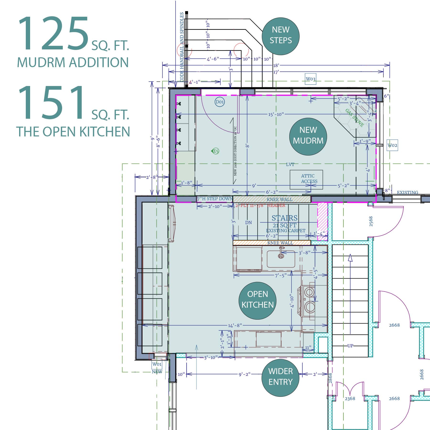
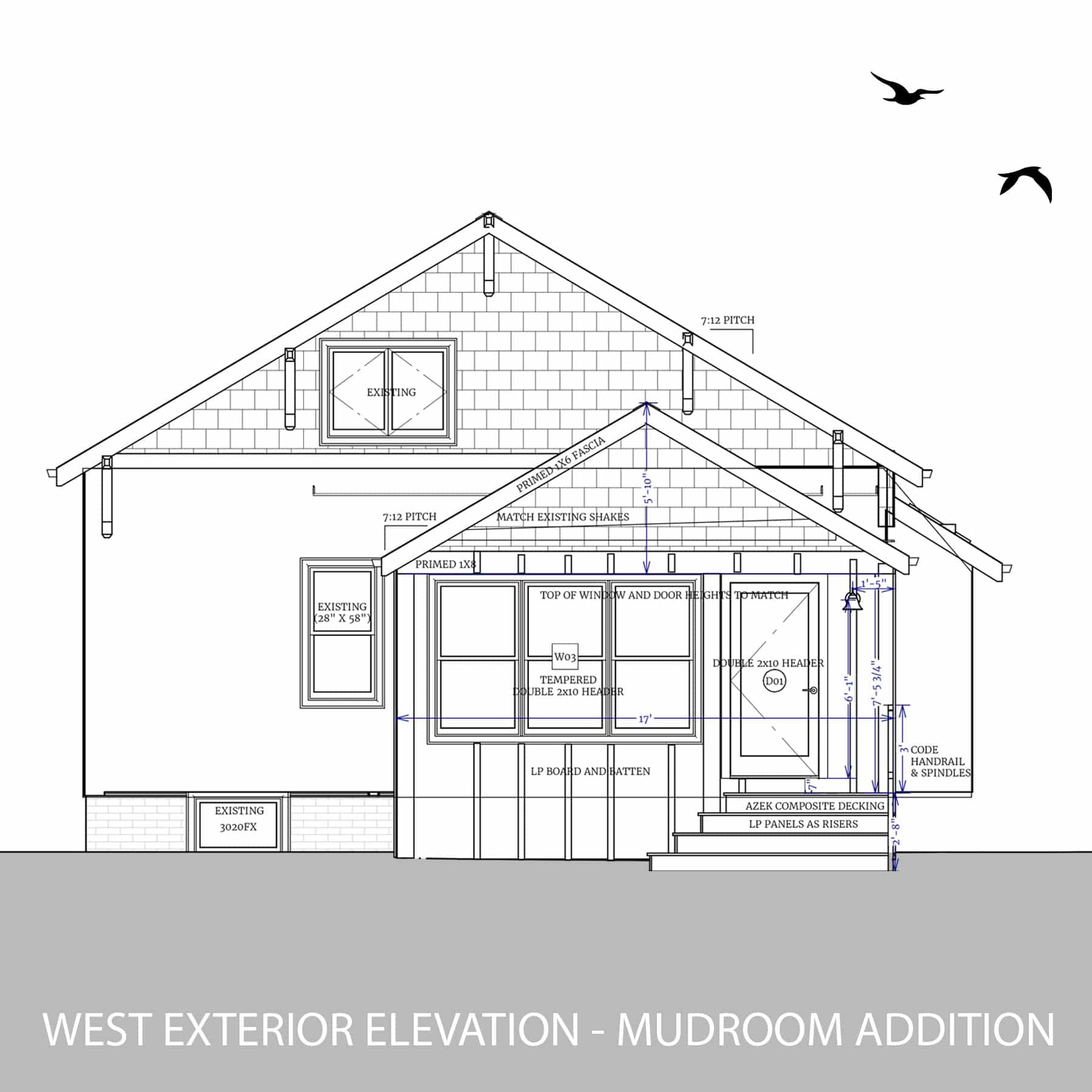
Without needing to move the range location, designers created a more functional, beautiful, and open kitchen by removing unnecessary walls between the kitchen and dining room, relocating large appliances, and removing the island. The Mudroom added more lighting and entry space, reinforcing the new, open-concept layout
The family really needed a better system for entering the home from the garage without getting immediately dumped into a closed-off kitchen. The design team created a thoughtful plan calling for a more generous mudroom addition. For added complexity, our clients asked that the new space create not only new cabinetry for storage but also function as a sunroom, transitioning them from inside to outside more seamlessly. White Crane designers filled the entire room with sunlight through the use of 63″ tall windows. With views to the rest of the yard, the windows emphasize the beauty of the outside world and create the sunroom escape the clients asked for in a mudroom.
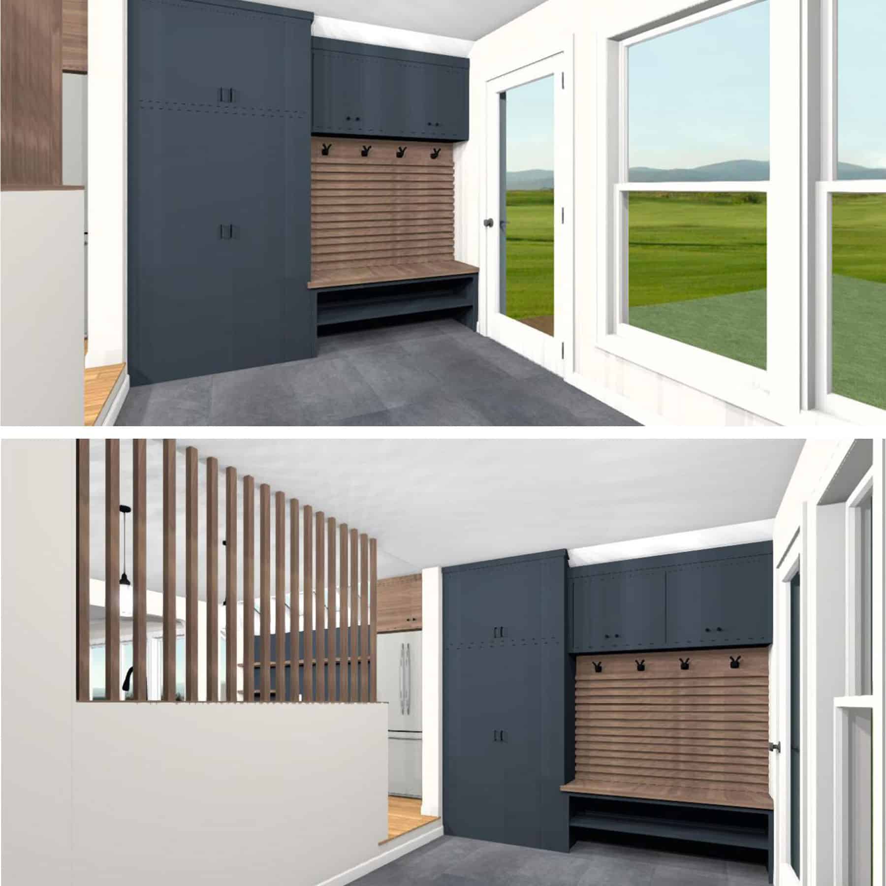
The lighting from the new 63" tall mudroom windows penetrates through to the kitchen, washing the home with afternoon rays. The vertical walnut slats allow the sunlight into the rest of the home with just enough visual distinction between rooms.
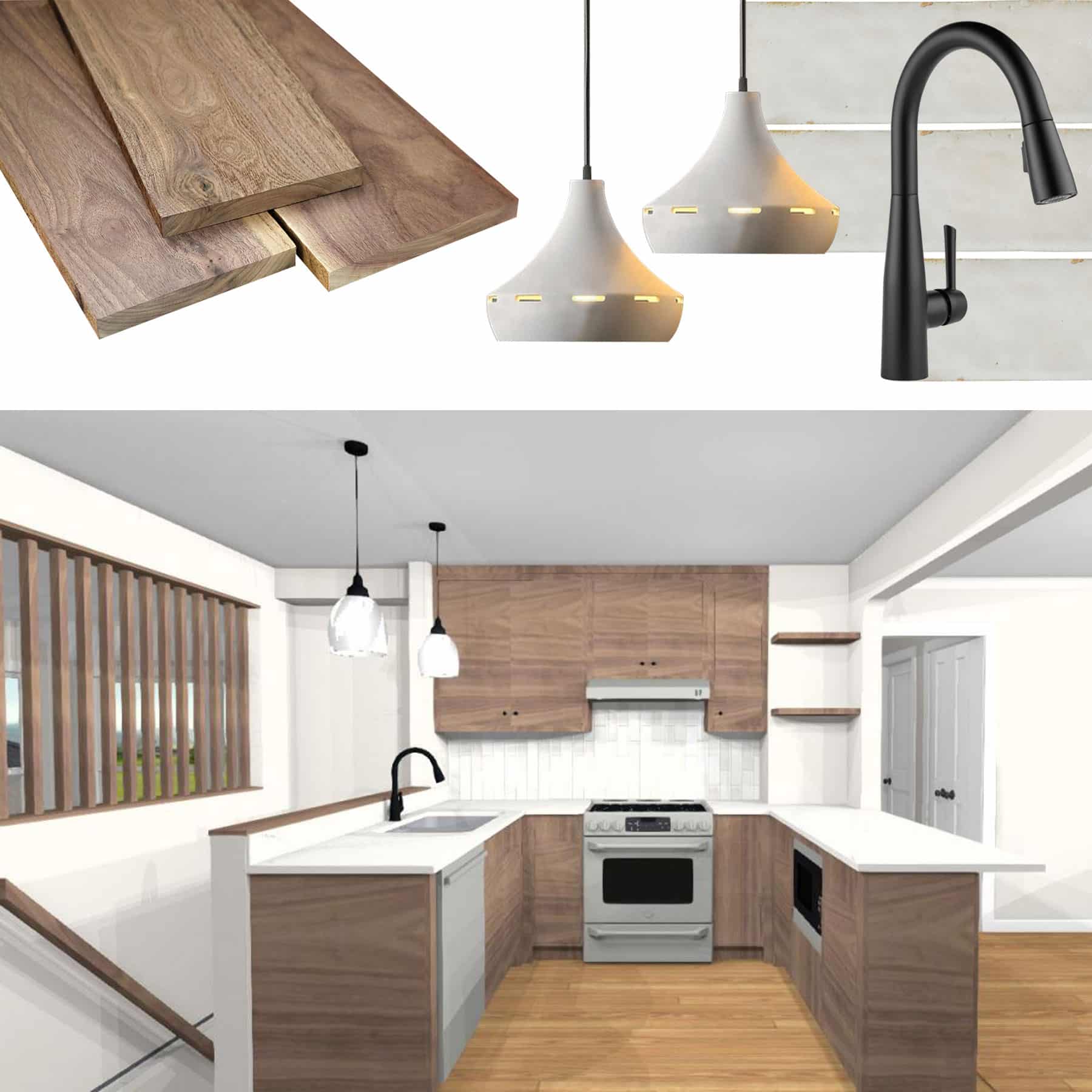
Selections for the kitchen merge mid-century modern sensibilities with Scandinavian accents through warm woods, bold faucet and appliance selections, and floating shelving.
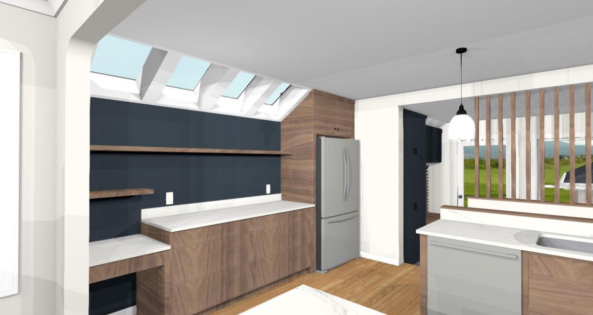
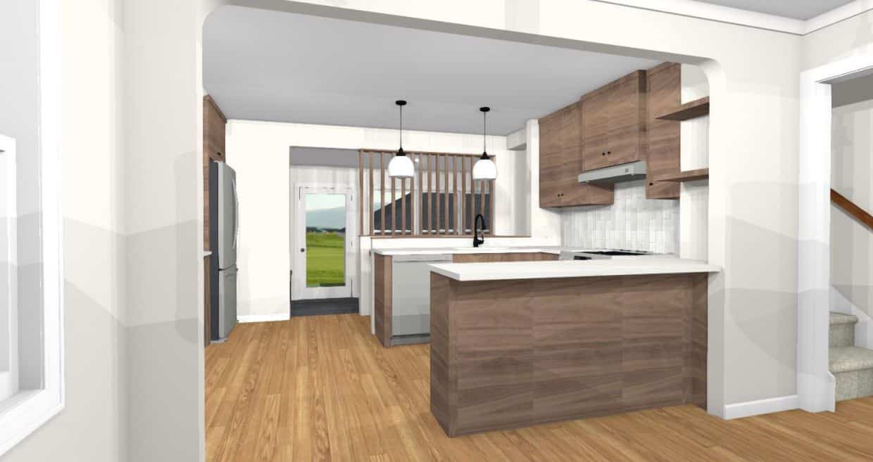
Bulky Island and Blue Accent Wall: In the new plan, the design team removed the bulky island that cramped the room, replacing it with a secondary prep area, new refrigerator, and expanded cabinetry solutions. Vivid blue accent walls, painted in Sherwin Williams, Sea Serpent, visually unite the new mudroom and kitchen spaces, working well with the walnut cabinets.
Looking from the Dining Room: From the dining room, the team removed much of the wall to enhance the maneuverability and line-of-sight between rooms. The curved corners of the opening are a subtle nod to the home’s 1920’s beginnings.
We’re here to help! Check out our planning resources below, or reach out to us here.