Ten Steps to the Home You Love
Here's the step-by-step process that ensures you’ll have a remodel you love.
See inside as we transform the kitchen and upper level bath of this 1920s Tangletown home.
You know it’s a good house when 2 decades of home ownership later, you’re still motivated to stay put. And that’s how our clients feel about this expansive Tangletown Colonial, with obvious assets from the lovely 1920s details and hardwood floors to the columned entry and generous dormers above. Though beautiful and incredibly charming, owning a 1920s home comes with 1920s maintenance. Having raised 3 now-grown children there, our clients were looking to refresh the home. Our design team took on the task of reviving two primary zones, the kitchen and upper level bath to help ensure our clients could stay in the home for many more years with less worry about major home repairs.
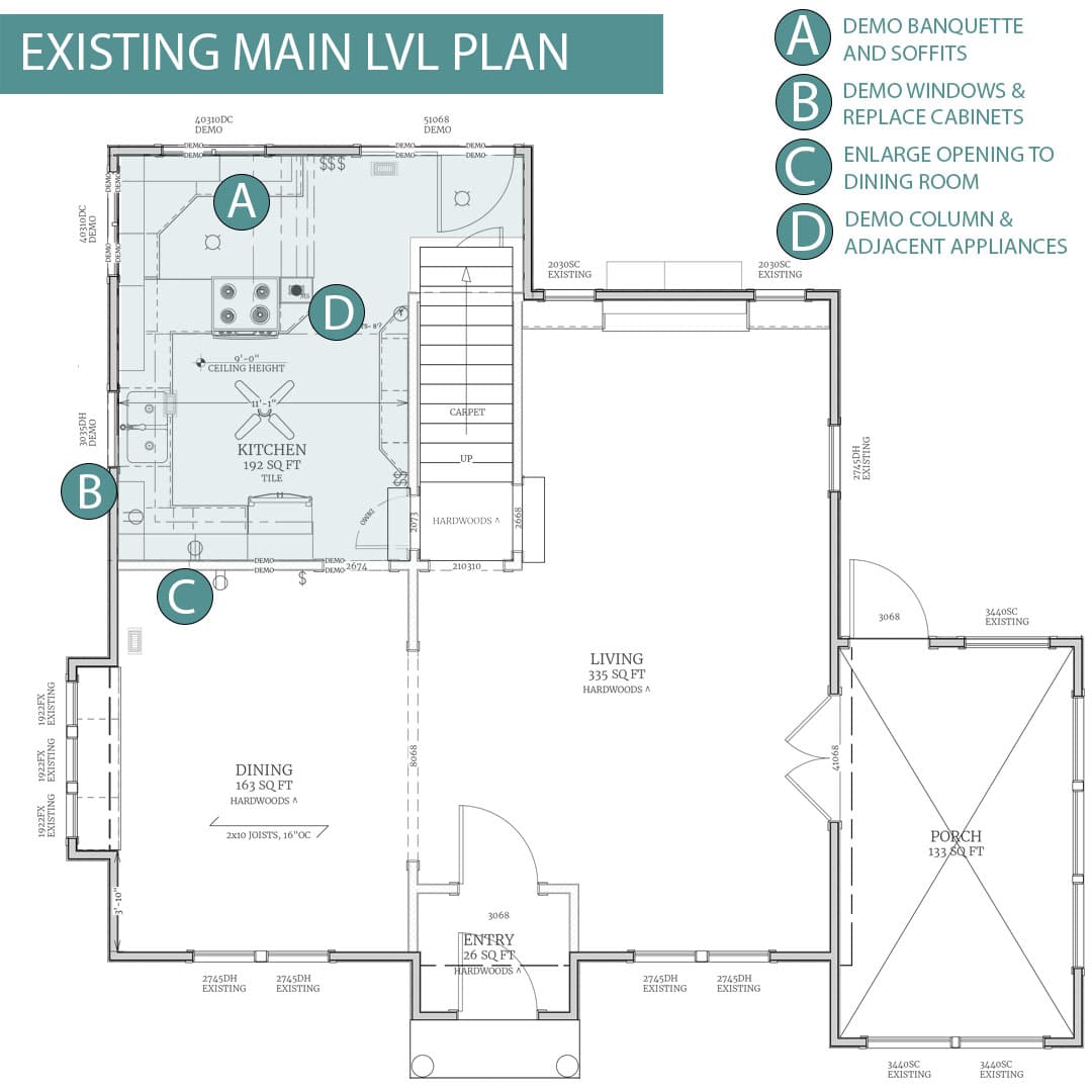
EXISTING: The banquette, kitchen soffits, and adjacent column created an unnecessarily cramped room. Plans to gut the entire room will provide a fresh start in rethinking the space and allowing the kitchen to feel more connected to the rest of the home.
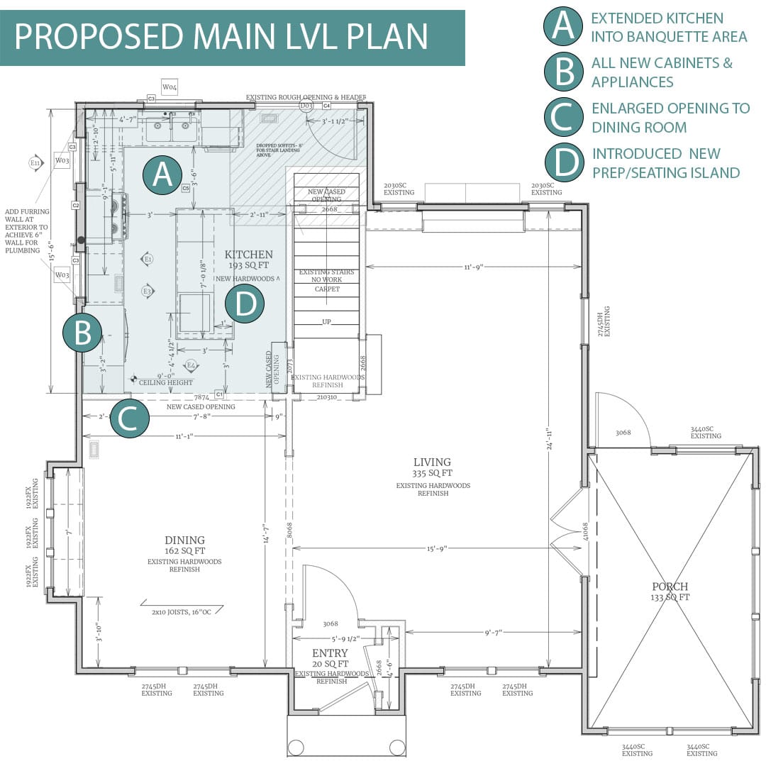
PROPOSED: The large opening between the kitchen and dining room plays a substantial role in increasing maneuverability across the entire floor, as the kitchen would no longer be a pinch point at the back of the home. Newly proposed windows will create a much brighter environment with a generously sized island proving a food prep and informal dining area. All new selections from the refrigerator to the tile and paints are an equally important element of the design scheme.
Apart from needing some general updates to refresh the interior, a previous 1980s remodel created some functional and maintenance issues that needed resolution, particularly centered around the upper-level bath and kitchen. The jacuzzi tub in the bathroom severely impacted the remainder of the room, with limited space for ideal toilet and shower placement. Similarly, the large, sunken tub necessitated oversized kitchen soffits in the kitchen/banquette, detracting from the open floor plan our clients desired, while the small and leaky shower caused unseen water damage.
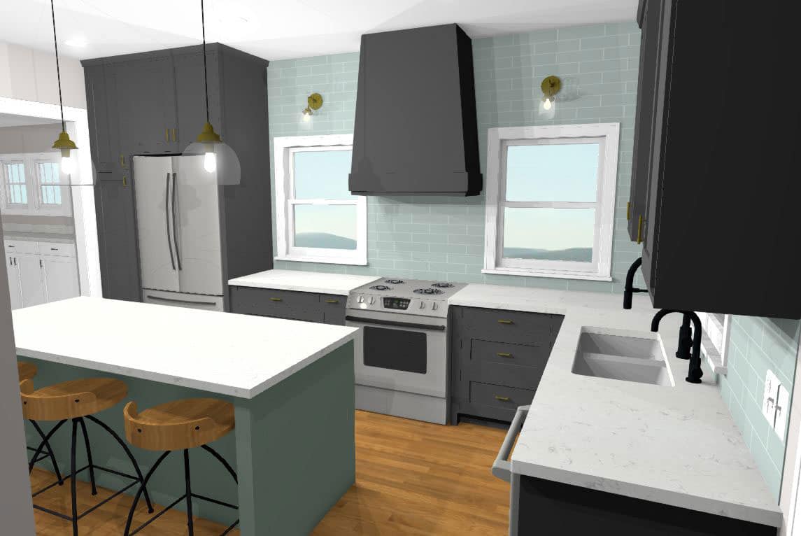
The kitchen rendering by our design team illustrates how the removal of the soffits will impact the kitchen. Now, the kitchen expands into the former banquette area with cabinets that extend to the ceiling above. Without a column limiting the room’s configuration, an impressive island will become a central focal point along with the bold color scheme a shapely hood.
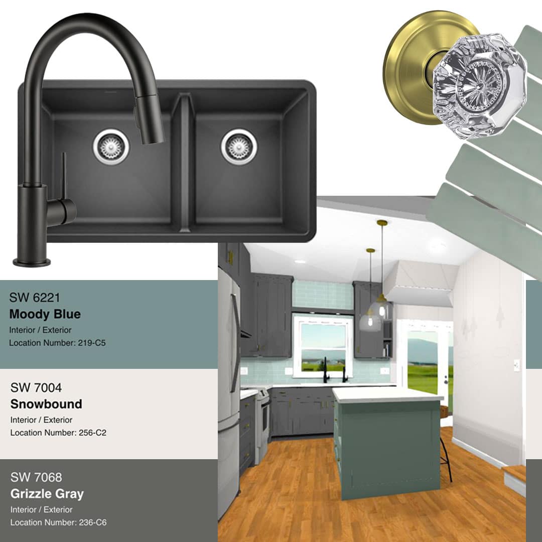
Muted gray cabinets in Sherwin Williams Grizzle Gray offer a quiet nod to the modern selections, complementing the charcoal sink and faucet. Pops of color create an impactful and layered design.
A successful remodel would be one that could open up the kitchen area to the rest of the home with a substantial prep and seating island as well as all new selections from cabinets to tile. With a main level facelift and a complete overhaul to the bathroom layout, including a private lavatory and tub area, this design would fulfill our clients’ vision to stay in the home long term. White Crane designers created a scheme that honored the 1920s home, enhancing the charm with an open plan and sophisticated interior selections.
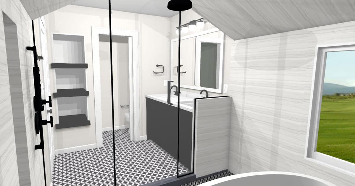
The upper level bathroom is a real showstopper. The sleek shower enclosure with a free standing tub is an incredible addition to the room and is accomplished by removing the existing sunken tub.
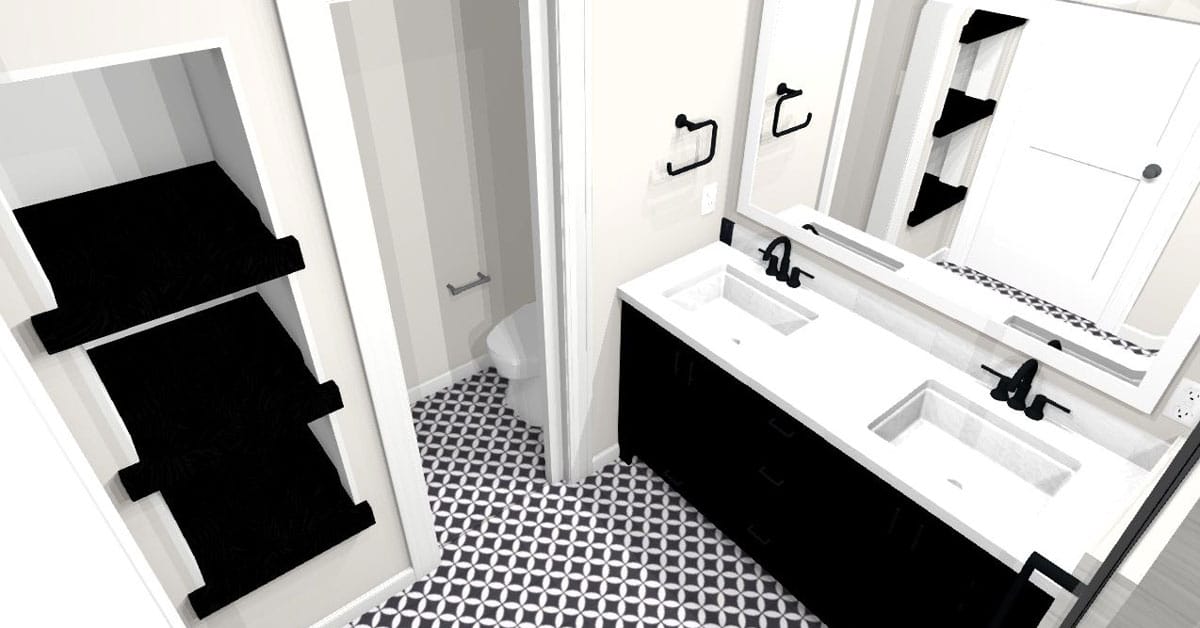
Two great features of the plan include the double vanity with plenty of storage and nearby open shelving. A pocket door disguises the private lavatory that will take the place of the previously cramped shower.
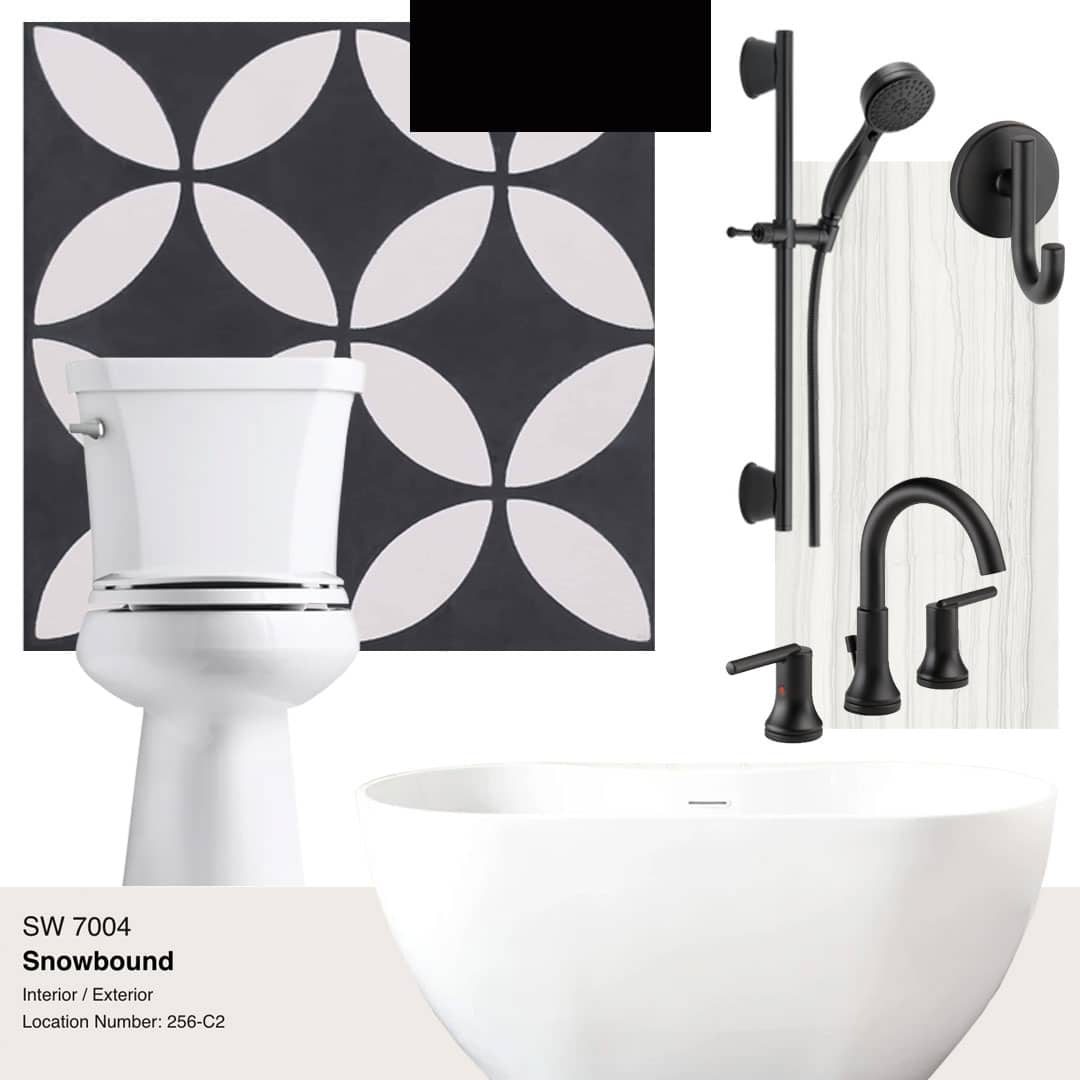
The black and white selections are obvious upgrades and were carefully selected with our designers working alongside our clients to make their ideal bathroom a reality. The black and white mosaic floor stops just shy of the shower where pitch black floor tile and grey and white wall tile create a modern bathroom escape.
We’re here to help! Check out our planning resources below, or reach out to us here.